盈袖20062013-03-03 19:42:01回複悄悄話
回複縱然平行的評論:
btw. what i was concerning using plain paper for the heart is that the color will become too dominon and make the whole card a bit too plain...
盈袖20062013-03-03 19:29:19回複悄悄話
回複縱然平行的評論:
you do have a sharp eye. I was thinking about put a plain color then thought the in color on the Designer's paper (summer starfruit) seems blend into the combination well.
So what color do you suggest for the heart. I am making some more and will try it
我自己比較喜歡清淡一些的,可以有幾種色彩,但是對比不是很大,基本上屬於同一個色係的。最近也想著,用淡咖或者很舊的牛皮紙那種的顏色,磨邊的粗紙質做底板,把我自己拍的黑白照片洗一些出來,直接貼在上麵,做成自己的卡片。以前就想到過了,那天看到阿蘇的卡以後又想起來。:)到時候拉你一起去逛granville island 的一家手工紙品店吧。
縱然平行2013-03-03 14:18:54回複悄悄話
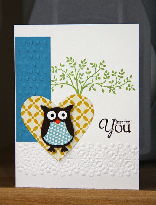
AJ, I really like your craft-work, they are artistic, beautiful and unique. The colors on this card is standout, yet complement to one and others.
However, I do like to file a "complaint" with you. To my eyes, the patterns on the heart and owl's body seem unnecessarily redundant. It may be true that those colorful geometric patterns bear some cute effects, but overall, they tiled scale and threat the overall balances.
Please don't be mad at me. I just tell you what I think, honestly. You don't punish honesty, do you ? Besides, what a guy like me knows about art. :)


是哦,每個人注意的東西都不一樣,是不是很有意思?你們的留言證實了我的想法,顏色還是最吸引人眼球的,第一時間抓住人的注意力,然後才是圖案等等
我亂講講啊,畫麵主題是貓頭鷹,所以後麵的那個藍色是不是有點太濃了,搶了主題的風頭?
btw. what i was concerning using plain paper for the heart is that the color will become too dominon and make the whole card a bit too plain...
回來啦:) 你說的是paper ya嗎?我有個主意,回頭給你郵件
you do have a sharp eye. I was thinking about put a plain color then thought the in color on the Designer's paper (summer starfruit) seems blend into the combination well.
So what color do you suggest for the heart. I am making some more and will try it
我自己比較喜歡清淡一些的,可以有幾種色彩,但是對比不是很大,基本上屬於同一個色係的。最近也想著,用淡咖或者很舊的牛皮紙那種的顏色,磨邊的粗紙質做底板,把我自己拍的黑白照片洗一些出來,直接貼在上麵,做成自己的卡片。以前就想到過了,那天看到阿蘇的卡以後又想起來。:)到時候拉你一起去逛granville island 的一家手工紙品店吧。
However, I do like to file a "complaint" with you. To my eyes, the patterns on the heart and owl's body seem unnecessarily redundant. It may be true that those colorful geometric patterns bear some cute effects, but overall, they tiled scale and threat the overall balances.
Please don't be mad at me. I just tell you what I think, honestly. You don't punish honesty, do you ? Besides, what a guy like me knows about art. :)
Have a great week ahead.
周末快樂!
2,字體改成鼠灰可能更統一氣氛:)
Happy Weekend!