These are the closest web references to your “Minimal Station Necklace” concept — especially the airy spacing, delicate rhythm, and modern minimal feel you’re aiming for:
Closest aesthetic match


What these references confirm stylistically:
-
Negative space is key — fewer beads feels more luxurious
-
Thin gold chain creates a more elevated modern silhouette
-
Station placement gives the piece “breathing room”
-
Tiny turquoise accents feel fresher and more contemporary than continuous beading
Your instinct toward simplification is very aligned with current fine-jewelry trends. (Kirsten's Corner)
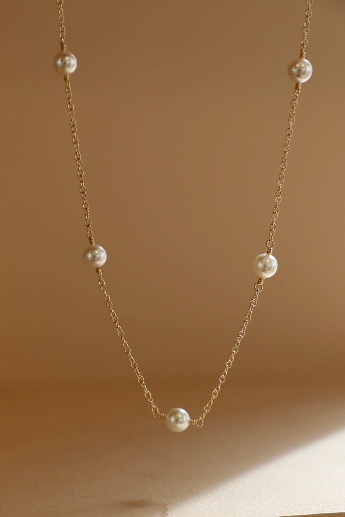
The strongest reference for your redesign
The most commercially relevant comparison is probably this type of station necklace:
Why this works so well:
-
asymmetry feels natural and effortless
-
pearls become focal points instead of texture
-
turquoise acts as accent color rather than pattern
-
chain becomes part of the design (important in luxury minimalism)
One important insight for your design direction
Your original necklace has:
-
beautiful color balance
-
delicate craftsmanship
-
nice rhythm
But the density of beads makes it read slightly more:
-
handcrafted/artisanal
rather than: -
luxury minimalist
The redesign direction toward stations and negative space pushes it into:
-
modern fine jewelry
-
elevated resort luxury
-
contemporary layering jewelry
That’s a very smart direction commercially right now.
I would especially study these details:
-
bead spacing ratios in (Kirsten's Corner)
-
how pearls are isolated rather than repeated
-
how gold chain visibility increases elegance
-
how irregular spacing feels more organic and expensive
This reference is also useful because it shows how ultra-minimal turquoise stations can feel very modern:


The strongest takeaway there:
fewer elements + better spacing = more sophistication.