不知道為什麽我的色彩,筆觸總是亂七八糟的,而且美譽哦厚重感,如何才能改變這一狀況呢?
不知道為什麽我的色彩,筆觸總是亂七八糟的,而且美譽哦厚重感,如何才能改變這一狀況呢?
•
我喜歡這樣的畫,為什麽人家色彩薄薄的,寥寥幾筆,效果那麽好,而我照著做,卻效果那麽差?
-阿紫紫的故事-
♀
![]()
![]() (143 bytes)
()
03/16/2013 postreply
06:50:02
(143 bytes)
()
03/16/2013 postreply
06:50:02
•
一般專家色差光影變化表現力較強。
-小小鈴鐺-
♀
![]() (0 bytes)
()
03/16/2013 postreply
07:00:08
(0 bytes)
()
03/16/2013 postreply
07:00:08
•
原來是這樣,那怎麽才能提高色差光影變化表現力呢?
-阿紫紫的故事-
♀
![]()
![]() (67 bytes)
()
03/16/2013 postreply
07:02:49
(67 bytes)
()
03/16/2013 postreply
07:02:49
•
沒有老師的話,多讀名作,多觀察,多動手。:)
-小小鈴鐺-
♀
![]() (0 bytes)
()
03/16/2013 postreply
12:28:12
(0 bytes)
()
03/16/2013 postreply
12:28:12
•
私比較喜歡你的色彩。。。
-Bornfree-
♀
![]()
![]() (0 bytes)
()
03/16/2013 postreply
16:26:29
(0 bytes)
()
03/16/2013 postreply
16:26:29
•
畫得真漂亮,尤其第三幅,你很會運用complimentary colors.
-小小鈴鐺-
♀
![]() (46 bytes)
()
03/16/2013 postreply
06:57:13
(46 bytes)
()
03/16/2013 postreply
06:57:13
•
啥是complimentary colors?因為oil太難得洗了,麻煩。不過等我這批丙烯用完了會考慮油畫。
-阿紫紫的故事-
♀
![]()
![]() (59 bytes)
()
03/16/2013 postreply
07:01:16
(59 bytes)
()
03/16/2013 postreply
07:01:16
•
在color wheel上正對麵的兩顏色是彼此的complimentary color,互相襯托。
-小小鈴鐺-
♀
![]() (0 bytes)
()
03/16/2013 postreply
12:30:11
(0 bytes)
()
03/16/2013 postreply
12:30:11
•
謝謝解釋!是不是complimentary color是很搭的顏色?在繪畫中可以大量應用來表現反差嗎?
-阿紫紫的故事-
♀
![]()
![]() (0 bytes)
()
03/16/2013 postreply
13:00:10
(0 bytes)
()
03/16/2013 postreply
13:00:10
•
也可以說很搭吧,有時用Split complementaries反而更和諧,講到顏色,
-小小鈴鐺-
♀
![]() (256 bytes)
()
03/16/2013 postreply
13:20:58
(256 bytes)
()
03/16/2013 postreply
13:20:58
•
我打錯個字,應該是 "comlementary".
-小小鈴鐺-
♀
![]() (0 bytes)
()
03/16/2013 postreply
13:27:30
(0 bytes)
()
03/16/2013 postreply
13:27:30
•
還是掉了個 p, 嗬嗬,別在意,是容易打錯 :))鈴鐺mm周末快樂!
-善和-
♀
![]()
![]() (0 bytes)
()
03/16/2013 postreply
14:01:46
(0 bytes)
()
03/16/2013 postreply
14:01:46
•
應是complementary,哈哈,我是丟三落四的馬大哈,善姐周末愉快!
-小小鈴鐺-
♀
![]() (0 bytes)
()
03/16/2013 postreply
14:06:42
(0 bytes)
()
03/16/2013 postreply
14:06:42
•
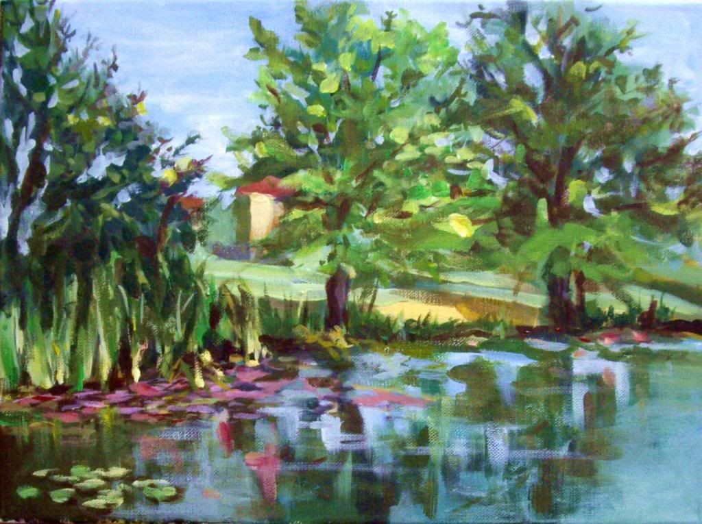
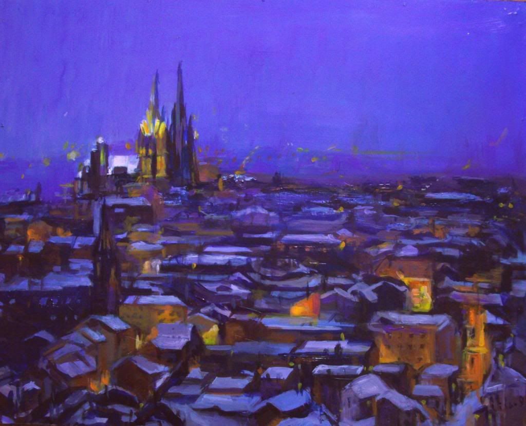
畫的太好了。水平很高,我看不出缺點。第三張是不是維也納斯特凡大教堂?
-G_Rainbow-
♂
![]()
![]() (0 bytes)
()
03/16/2013 postreply
07:06:08
(0 bytes)
()
03/16/2013 postreply
07:06:08
•
謝謝誇獎,這是我們這裏一個教堂,沒什麽名氣的。
-阿紫紫的故事-
♀
![]()
![]() (0 bytes)
()
03/16/2013 postreply
07:15:10
(0 bytes)
()
03/16/2013 postreply
07:15:10
•
特別喜歡水中的倒影 :)
-善和-
♀
![]()
![]() (0 bytes)
()
03/16/2013 postreply
09:04:23
(0 bytes)
()
03/16/2013 postreply
09:04:23
•
謝謝~~~
-阿紫紫的故事-
♀
![]()
![]() (0 bytes)
()
03/16/2013 postreply
13:01:03
(0 bytes)
()
03/16/2013 postreply
13:01:03
•
筆觸大小節奏可以加強,畫得很有調味。
-漢至-
♂
![]()
![]() (0 bytes)
()
03/16/2013 postreply
09:17:10
(0 bytes)
()
03/16/2013 postreply
09:17:10
•
'畫得很有調味。'調味是什麽意思啊?
-阿紫紫的故事-
♀
![]()
![]() (0 bytes)
()
03/16/2013 postreply
12:58:30
(0 bytes)
()
03/16/2013 postreply
12:58:30
•
色調和味道呀:)
-漢至-
♂
![]()
![]() (0 bytes)
()
03/16/2013 postreply
15:21:14
(0 bytes)
()
03/16/2013 postreply
15:21:14
•
你的畫,
-東東111-
♂
![]()
![]() (32 bytes)
()
03/16/2013 postreply
10:57:47
(32 bytes)
()
03/16/2013 postreply
10:57:47
•
油膩是不是因為刷了vernis啊。我喜歡厚重的色彩,國畫也喜歡重彩畫。但是對顏色的把握不到位。鬱悶。
-阿紫紫的故事-
♀
![]()
![]() (0 bytes)
()
03/16/2013 postreply
13:02:31
(0 bytes)
()
03/16/2013 postreply
13:02:31
•
那個夜景太棒了。筆觸挺好,顏色再講就一點就更好的啦。
-在座-
♀
![]()
![]() (0 bytes)
()
03/16/2013 postreply
11:19:54
(0 bytes)
()
03/16/2013 postreply
11:19:54
•
‘顏色再講就一點就更好的啦。’能具體說說怎麽講究嗎?是不是色彩的細微變化轉折不夠?
-阿紫紫的故事-
♀
![]()
![]() (0 bytes)
()
03/16/2013 postreply
13:03:37
(0 bytes)
()
03/16/2013 postreply
13:03:37
•
喜歡你的筆觸!粗獷,但準確!
-影雲-
♀
![]()
![]() (0 bytes)
()
03/16/2013 postreply
14:12:24
(0 bytes)
()
03/16/2013 postreply
14:12:24
•
色彩感覺很好。沒有感覺亂呀。。。
-Bornfree-
♀
![]()
![]() (0 bytes)
()
03/16/2013 postreply
16:22:39
(0 bytes)
()
03/16/2013 postreply
16:22:39
•
如果追求畫麵簡練,右邊那棵樹可以省去,不過整個compositon要調整----個人見解
-chunjingjing-
♀
![]() (0 bytes)
()
03/16/2013 postreply
17:10:41
(0 bytes)
()
03/16/2013 postreply
17:10:41
•
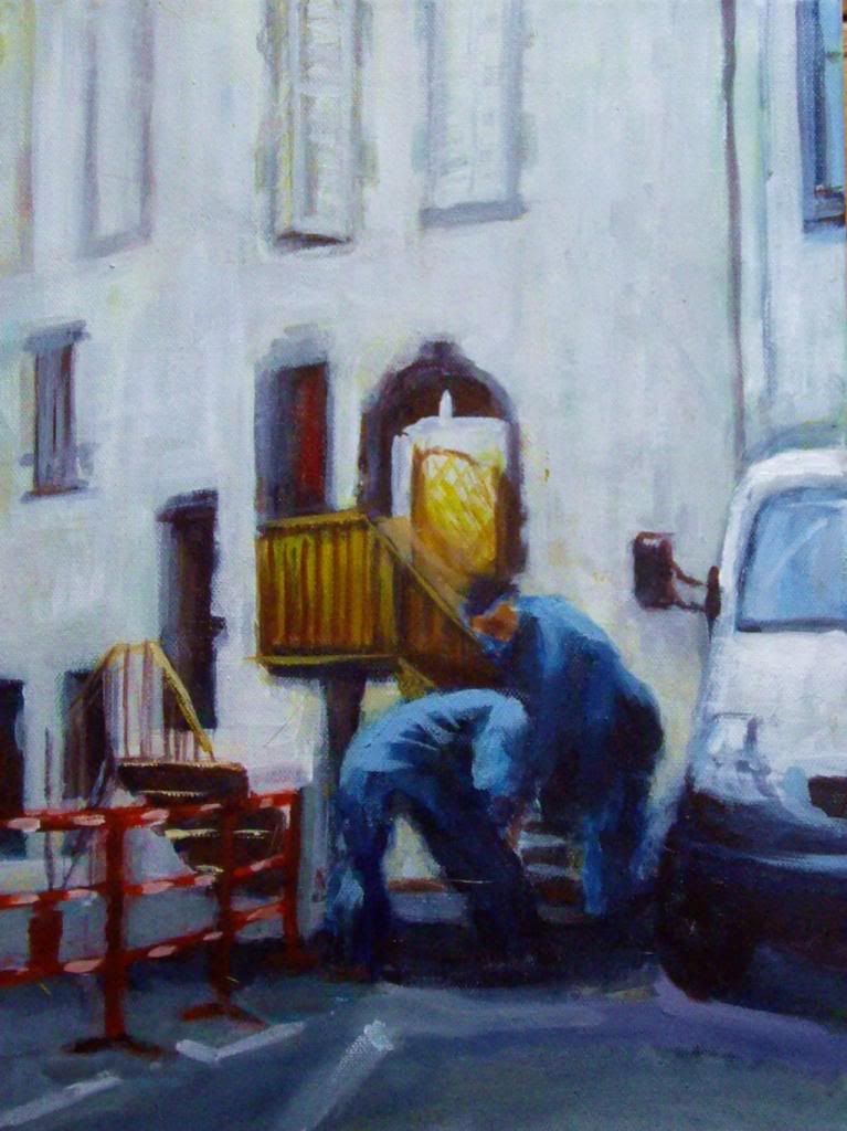
第二幅有意思,尤其那個彎腰背對的人畫的好。
-宗闋-
♀
![]()
![]() (0 bytes)
()
03/17/2013 postreply
06:32:55
(0 bytes)
()
03/17/2013 postreply
06:32:55
•
非常棒!盡管我偏好水彩,這丙烯的夜景更濃鬱,有凡高的韻味!
-laolaoliu-
♂
![]()
![]() (0 bytes)
()
03/17/2013 postreply
11:24:10
(0 bytes)
()
03/17/2013 postreply
11:24:10
WENXUECITY.COM does not represent or guarantee the truthfCCPA ulness, accuracy, or reliability of any of communications posted by other users.
Copyright ©1998-2026 wenxuecity.com All rights reserved. Privacy Statement & Terms of Use & User Privacy Protection Policy