1.

2.

3.

4.

5.

6.

1.
2.
3.
4.
5.
6.
•
喜歡#6的情調。
-多城居士-
♂
![]()
![]() (0 bytes)
()
04/11/2012 postreply
18:15:46
(0 bytes)
()
04/11/2012 postreply
18:15:46
•
總體構圖太滿畫麵不透氣,調子壓抑。第2片還有一種歪歪的趕腳,認真看看也不知哪裏歪。
-俗家棍僧1-
♂
![]() (0 bytes)
()
04/11/2012 postreply
18:18:14
(0 bytes)
()
04/11/2012 postreply
18:18:14
•
反差過強,丟了些層次!
-YuFoto-
♂
![]() (0 bytes)
()
04/11/2012 postreply
18:28:09
(0 bytes)
()
04/11/2012 postreply
18:28:09
•
丟一小磚 - 後期不認真,髒點都沒去掉。
-JZUO-
♂
![]()
![]() (0 bytes)
()
04/11/2012 postreply
18:56:01
(0 bytes)
()
04/11/2012 postreply
18:56:01
•
回複:喜歡1,3, 6和視角。2,3, 4, 5好像都有些過曝?
-其無-
♂
![]() (0 bytes)
()
04/11/2012 postreply
19:52:56
(0 bytes)
()
04/11/2012 postreply
19:52:56
•
#1的門太靠邊了。3,4線條太多。
-nanjing2-
♀
![]() (0 bytes)
()
04/11/2012 postreply
20:31:04
(0 bytes)
()
04/11/2012 postreply
20:31:04
WENXUECITY.COM does not represent or guarantee the truthfulness, accuracy, or reliability of any of communications posted by other users.
Copyright ©1998-2024 wenxuecity.com All rights reserved. Privacy Statement & Terms of Use & User Privacy Protection Policy
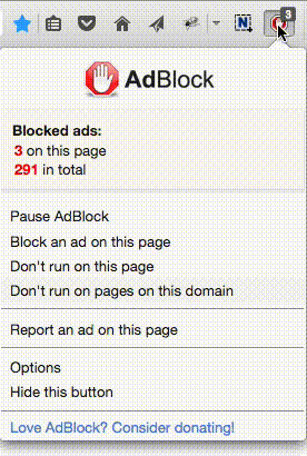
 選擇“Disable on www.wenxuecity.com”
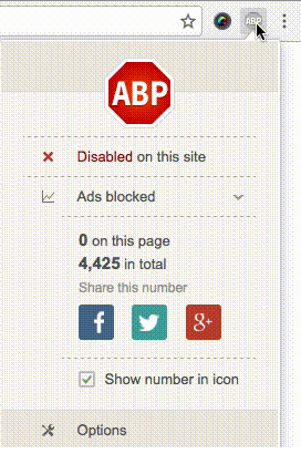
 選擇“don't run on pages on this domain”