正文
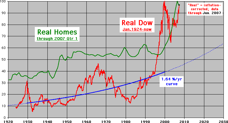
Dow and Home Prices Adjusted for Inflation: 1924 - 2007 Dow Only Adjusted for Inflation: 1924 - 2007  Last Upate: August 2007 |
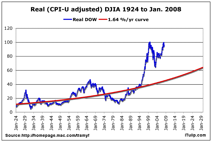
| The chart above, and the analysis behind it, is the work of an analyst who prefers to remain anonymous. His web site and further details about the analysis behind this chart, and other compelling observations, are available at his web site here. This chart shows the Dow Jones Industrial Average (DJIA), an index of 30 stocks also known as the DOW, from 1924 to March 2006. This DOW chart, unlike charts you are used to seeing, is adjusted for inflation. Why adjust the DOW for inflation? If you don't, changes in the price of the DOW over periods of years are not meaningful. For example, the DOW was 11,000 at some time in 2001 and 11000 again in 2006. Financial reports will often look at these two price points and state that the DOW has "stayed flat." Not great but not bad, right? But inflation has increased at least 2.5% per year since 2001, although there is good evidence that the average inflation rate is significantly higher. The author of this analysis used a DOW starting value of 8.42 for the year 1924. Since then, that value has increased at an inflation adjusted annual rate of 1.64% per year. Yes, you read that correctly. The real annual rate of return on the DOW over the past 82 years has by his careful calculation been 1.64%. That modest rate of return has had many dramatic periods of ups and downs that have given the average investor little net benefit. But these ups and downs, known in the business as volatility, been a boon to brokers. Still, the DOW beats the real estate market, which has stayed more or less even with inflation for the past 100 years. As bad as an average annual 1.64% real return sounds, it gets worse. Warren Buffett recently noted that frictional costs for all U.S. stocks run between -1.0 and -1.5 % per year annually. As the Forbes article states, "In other words, the burden of paying Helpers may cause American equity investors, overall, to earn only 80 percent or so of what they would earn if they just sat still and listened to no one." A few critics of this analysis point out that it does not take into account long-term past Dow dividend yield: 2.3 % per year. Let's see: 1.64% minus 1.25% plus 2.3% equals 2.69%. Not as bad as 1.64%, but still nothing to write home about. Start off with $100,000, add 10,000 annually, compund 2.69% annually, and after 10 years you got $246,456.86. |
| Another way to look at this is in terms of the point price of the DOW as reported and use the Real DOW to make inflation adjustments. For example, the DOW averaged 11281.26 in January 2000, when the Real DOW = 100.0, and both are the all-time nominal highs. In April 2006, 6.25 years later, the DOW averaged just 0.4% less at 11234.68, but the Real Dow is 16.4% less at 83.6. That's because consumer prices rose 19.1% -- the Real DOW inflation index CPI-U increased from 168.8 to 201.1. Using DOW 11281.26 in 2001 as a starting point, the purchasing power of a “share” of the DOW since then is worth 16.4% less as of the date of this report (April 22, 2006) than the average price in 2000. That means the real DOW in terms of purchasing power is "worth" 9480 in 2000 dollars when it is reported at the 11340 closing price Friday, April 21, 2006. In other words, think of the DOW at 11340 today the way you would have thought about the DOW at around 9480 in 2000. You’ll notice how dramatically the inflation-adjusted DOW started to rise April 1995, about 20 months before Alan Greenspan's famous Irrational Exuberance speech. It has adjusted down moderately since then but has a way to go to reach it’s 1.64% trend line. |
 DJIA adjusted for inflation 1924 - 2007 |
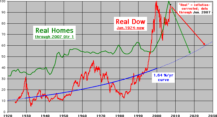
| On April 22, 2006 I venture where the author of the chart does not go. I have added to his chart three red lines marked A, B and C to represent three arbitrary potential paths of the DOW back to the trend. Of course, no one can assign a probability to these or any other guesses at a future outcome for the DOW, and a straight line down is really unlikely. All you can say for sure is that the real DOW will revert to the mean and that there are two ways for it to do so: deflation as occurred in the correction from 1930 to 1931 or inflation as from 1965 to 1983. As long term iTulip.com readers will tell you, I have been solidly in the inflation camp since proposing Ka-Poom Theory in 1999. I throw out three paths of inflation to get the DOW back to trend: (A) rapid, (B) moderate and (C) slow. For selfish reasons, I prefer the (A) case because it gets it over with before I’m too old to care, but it's no more likely than any other path... the market doesn't care any more about what I wish for than the moon cares what I think about its orbit. Path (A) implies an inflation-adjusted DOW of around 50 in five or six years from its current value of 85, about a 40% decline. Not a 40% nominal decline but a 40% real decline on top of the 15% real decline we have seen from its peak in 2000. One way to get there is for the nominal DOW to stay about where it is at 85 on the chart above -- that's 11,000 and change in the actual DOW index price -- and for inflation to rise around 70% for the period. That’s similar to the 1975 to 1983 scenario, but of course two periods are never quite the same. It's not far off from the 100% six year inflation scenario I cooked up to save the average savings-less, over-indebted U.S. home owner's bacon. Also coincides with the commodities boom that guys like Jim Rogers have been predicting since 1999. Let's watch over the years to see which path the Real DOW takes. |
評論
目前還沒有任何評論
登錄後才可評論.


