


2010 (5)
2011 (2)
2013 (42)
2015 (93)
2016 (126)
2017 (121)
2018 (90)
2019 (105)
2020 (233)
2021 (239)
2022 (249)
2023 (295)
2024 (367)

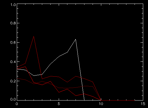
The plot shows the relative increase of new patients each day, starting from about the same stage (about 1500 patients). You can see Korean has been quite successful to cut the rate of increase significantly in 10 days (ignore the last point that drops to zero). Italy (dark red) made some progress but then stalled . 近五天沒有進步。 西班牙也是隻有微小改善。
美國(白色)目前比那幾個糟糕得多,不明白為什麽。應該是因為人口比較稀少不應該增加這麽快,但是卻更壞。
歐洲美國如果不能在兩周之內把單日相對增長率降低到0。1以下,會有上百萬的病人。那時候再搞什麽呆家裏隔離已經沒什麽意義,不如大家出來該幹什麽幹什麽,有一部分人生病也隻好由它去了。