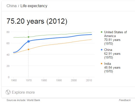
Interesting curves - 中國 平均壽命 in 50 years (1960-2010)
I happened come across this images. Using US and India as "upper and lower" range, China data moved away from lower range and moved up quickly 1960-1970, then slowly approaching the upper limit.
WENXUECITY.COM does not represent or guarantee the truthfulness, accuracy, or reliability of any of communications posted by other users.
Copyright ©1998-2025 wenxuecity.com All rights reserved. Privacy Statement & Terms of Use & User Privacy Protection Policy